In the ever-growing world of technology, visuals do far more than just decorate a report: they simplify the complexity of the data and invite interaction from the audience. Whether trying to explain a global pandemic or mapping internal thought processes, the type of visualization chosen to represent the data can either clarify the message or make it even more confusing.
Understanding the differences between types of data visuals can help you to represent the data properly. These differences aren’t just terms in a book, they help shape how we see, feel, and act on the information in front of us.
There are four primary types of information visuals: conceptual-declarative, conceptual-exploratory, data-driven declarative, and data-driven exploratory.
Conceptual-Declarative
Explains an idea, process, or system clearly and directly without data. It tells the audience what the data is in a structured, linear format. The goal with this type of visual is to deliver a digestible understanding of a concept.
Example: The Periodic Table of Visualization Methods
Source: Lengler & Eppler, University of Lugano
This visual maps different types of visualization methods using the metaphor of the periodic table. The online version is interactive if you hover over each of the elements, but downloaded as a .pdf it is a true conceptual-declaritive example.This is effective because it uses a structured categorization format that people are already familiar with.
Conceptual-Exploratory
A visual meant to explore an idea or system, inviting the viewer to navigate, reflect, or discover their own meaning from the data. This encourages intellectual or emotional exploration of a concept.
Example: Dear Data Project
Source: Giorgia Lupi & Stefanie Posavec, 2016
The designers in this project visualized aspects of their daily lives (distractions, mindfulness, complaints, quarantine life, emotions, etc.) through abstract and information-coded drawings. The audience decodes the legend and symbols, which invites active engagement, to find meaning for each of the index cards. This kind of data visual is subjective, as it maps the feeling of data, not just the facts.
As McCandless emphasizes in his TedTalk, “design is about solving a problem.” Here, the problem is how to communicate across distance (during the COVID-19 Pandemic) using both concept and art.
Data-Driven Declarative
This visual uses data to make a clear point and is structured, often journalistic in tone and guides the audience to a specific conclusion. For a data-driven declarative, the goal is to inform or persuade through this structured evidence.
Example: South China Morning Post’s “How the Australian Bushfires Spread”
Source: South China Morning Post, 2020
This explanatory visual combines maps, charts, and timelines to show the scale and sequence of wildfire events. I specifically appreciate the UX design of the website, how when a user scrolls, more information is revealed with the image of the smoke. The data is contextualized and the site has quantitative visuals that are paired with narrative.
This example demonstrates what McCandless calls the “storytelling power of juxtaposition,” showing not just numbers but consequences. This type of visual plays a key role in public understanding by helping audiences see not only the what (data from wildfires), but the why (graphics of areas affected).
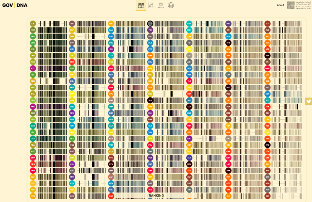
Data-Driven Exploratory
An interactive or layered visual that lets users navigate a dataset. Rather than telling a fixed story, it allows the viewer to ask their own questions to support their discovery.
Example: GOV | DNA Visualization
Source: UK Government Digital Service
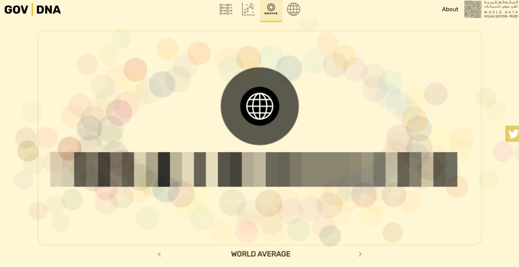
This interactive dataset allows the audience to explore government data by department, budget, or function. It’s structured like a map but offers no particular path. The high interactivity allows for a tailored user experience, it’ll be unique every time. The filters and categories support multiple exploratory paths, and the user can even change how they’re seeing the data. This example also reflects key EDA principles: users scan for contrast, focus on a few key items, and naturally seek patterns and meaning.
As outlined in GeeksforGeeks’ guide to EDA, exploratory visuals help uncover hidden trends, outliers, and patterns not visible through linear analysis.
Again referring back to McCandless’ TedTalk, this example demonstrates the power of the “media panic vs. actual death toll” chart, as this visual lets the audience form their own conclusions through the data.
Why it matters
In The Beauty of Data Visualization (again, I know), McCandless reminds us that “by visualizing information, we turn it into a landscape we can explore with our eyes, a sort of information map.” Whether guiding a viewer toward a conclusion or inviting them to wander through the different layers of data, the kind of visual we choose to represent our data matters deeply.
As further supported by the GeeksforGeeks guide to EDA, visuals are most empowering when they support the way we actually think: non-linearly (shout out to my fellow ADHDers). The visual can help us cut through noise, identify what and why it matters, and then going on to ask better questions.

Leave a comment