The “Experience Economy” has changed how people evaluate products and services. Value no longer comes only from what something does, but from the quality of the experience surrounding it. For designers, this shift places emotion at the center of their work.
by Andreas Komninos, Interaction Design Foundation
Why Emotion Drives Good Design
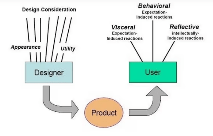
Donald Norman’s framework shows that people respond to design on three levels:
Visceral Design: immediate, sensory reactions. How does something make a user feel? “Visceral design aims to get inside the user’s/customer’s/observer’s head and tug at his/her emotions either to improve the user experience” (Komninos, Interaction Design Foundation).
Behavioral Design: or usability design. How users are carrying out their actions, how quickly and accurately the design works for those specific tasks, and how well the end product can accomodate experienced and inexperienced users.
Reflective Design: Can you tell a story about your product? “This is the highest level of emotional design; representing the conscious thought layer, where we consciously approach a design; weighing up its pros and cons, judging it according to our more nuanced and rational side, and extracting information to determine what it means to us as an individual” (Komninos, Interaction Design Foundation).
Ddesigning based on the audience’s emotion builds on this concept. Usability is essential, but emotional connection is what makes an experience memorable. Emotion shapes trust, satisfaction, and long-term loyalty.
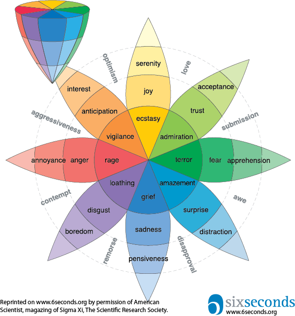
Tools like Plutchik’s Wheel of Emotions, as shown above, helps designers understand how different emotional states can be activated or supported through color design choices. Knowing which emotions users may experience during their visit to whatever you’re providing, allows designers to create more curated journeys.
Every choice can help form an emotion
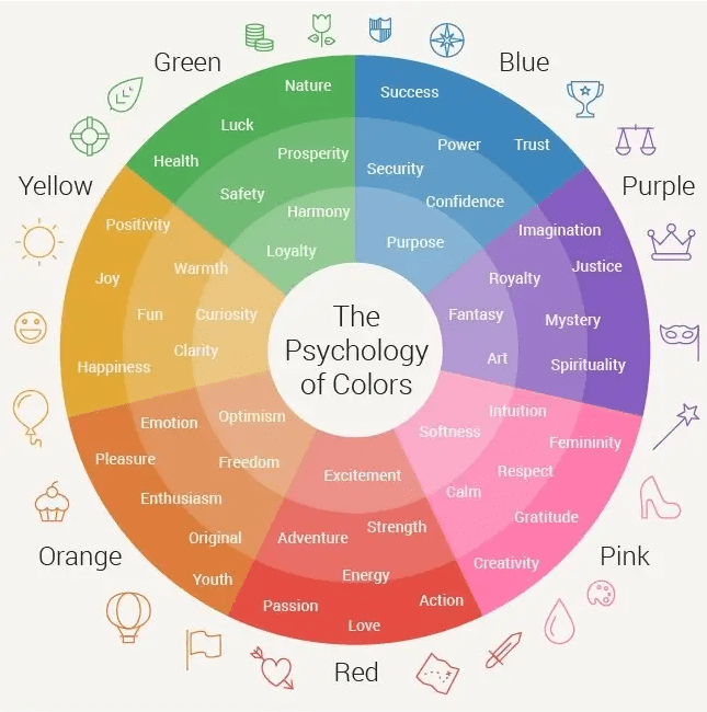
Color, typography, and layout all influence how users interpret and feel about a product. This goes along with branding and styleguides for the organization; which colors will be memorable for the thing that you ultimately do? The below chart shows which colors are associated with which feeling users can associate with the product. Though similarly colored to the wheel of emotions, you’ll see that there are entirely different results here.
by Céillie Clark-Keane, WordStream by LocalQ
Color psychology directs attention, creates mood, and communicates brand personality. By using the above wheel with the coordinating emotions you’re aiming your product to have, you can create a powerful dynamic.
Here are some more fundamental color associations to consider:
8 Ways to Use Color Psychology in Marketing (With Examples)
Red: excitement, passion, anger, danger, action, anxiety, power.
Orange: playfulness, friendliness, creativity, warmth, enthusiasm.
Yellow: happiness, optimism, warning, joy, originality, enthusiasm.
Green: Youth, vibrancy, vigor, nature, growth, stability.
Blue: Calm, stability, depth, peacefulness, trust.
Purple: Royalty, luxury, romance, introspection, calm.
by Céillie Clark-Keane, WordStream by LocalQ
When using color psychology, you want to start with the emotion you’re aiming for first. The next step is to get inspiration, find other brands that are utilizing this theory in their marketing strategies and document it. After that you’ll create a color palette, keeping the colors consistent with your brand. Creating a color scheme to work out of allows for variety, but equally sets standards.
Here are a few common types of color palettes:
8 Ways to Use Color Psychology in Marketing (With Examples)
Analogous: Colors next to each other on the color wheel.
Complementary: Opposite colors that create high contrast.
Monochromatic: Different shades or tones of the same primary color.
by Céillie Clark-Keane, WordStream by LocalQ
Now, onto fonts
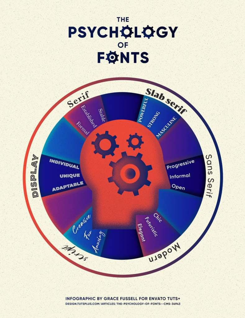
Grace Fussell demonstrates that typography affects tone and credibility of your product. Fonts can signal stability, creativity, sophistication, or playfulness long before a user reads the actual content. These visual elements work together, shaping perception through subtle but powerful cues.
Fussell has created a visually interesting piece about the way fonts can be psychologically associated. Serifs are trustworthy; Slab Serifs are powerful; Sans Serifs are friendly; Modern Sans Serif are chic; Scripts are fun and less serious; Display are independent and stand-alone.
The takeaway from this? Fonts matter! And a quick note on the difference between a font and typeface:
“Font” and “typeface” are two terms that are often incorrectly used interchangeably.
Fonts & Feelings: Does Typography Connote Emotions? by Sophia Bernazzani
A font is one particular weight and style of a larger typeface. Typefaces are categories comprised of many different fonts. For example, Serif is a typeface, and Times New Roman is a font that is part of the Serif family.
Mood Boards as planning tools
Briefly mentioned earlier, comprising a list of inspirational brands/marketing tactics is helpful when coming up with a plan for emotional marketing. Mood Boards are another part in that process, and can help you lay out everything you need: inspiration from others, a font (or three) that you’ve picked out for the product, images to invoke emotion, color palettes, a song maybe.
Take the following mood board. Can you guess which brand or product that it’s for?

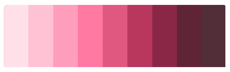
The custom font definitely gave it away: Mountain Hardware, after their rebranding in 2023. They incorporated a new font to their title and heading texts, but still went with quadrants for body copy. The yellow is the brand’s new color, with yellow being associated with the enthusiasm of enjoying the outdoors.
The colors shown below the main brand color are the new color schemes they’re focusing on in 2025. The colors they chose for the clothing are usually paired together, so the monochomatic scheme is in full swing here. They will also pair these colors with both white and black, end even use two colors and black.
Design’s role in the “Experience Economy”
People have begun to expect meaningful, coherent experiences, and design becomes a strategic tool in marketing plans. Emotion, visual psychology, and user understanding are not optional – they are core components of successful products and services.
By integrating emotional research, visual communication principles, and user-centered methods, designers can create experiences that are functional, engaging, and genuinely valuable to the people who use them.

Leave a comment