When we visualize geospacial data, it often feels natural to reach for a type of map that you use everyday. After all, if Google Maps uses it, why shouldn’t we? But this instinct, as cartographer and visualization expert Ken Field reminds us, deserves a more careful examination.
When Maps Mislead
In her WIRED article, “Is the US Leaning Red or Blue? It All Depends on Your Map,” Issie Lapowsky explores how traditional election maps, like the red-and-blue county maps per state, distort political reality. These maps represent land, not voters. Vast red plains dominate visually, even though they represent far fewer people than densely packed blue cities. In truth, the nation’s political makeup is far more balanced, nuanced, and—if visualized differently—more purple than we often think.
This visual imbalance isn’t accidental. Maps make choices, whether we see them or not: color scales, data aggregation, region boundaries, and map projection all influence how we interpret what we see. When maps amplify area over people, or simplify diverse voting populations into binary hues, they do more than inform. They persuade.
Matthew Ericson, former graphics editor at The New York Times, echoes this caution in his essay, “When Maps Shouldn’t Be Maps.” He reminds us that not every dataset deserves a geographic canvas. When geography isn’t central to the story, mapping can obscure rather than clarify. For instance, a table might better reveal which neighborhoods were most vulnerable to flooding than a map saturated with overlapping colors. A chart may highlight voting shifts more effectively than a precinct map ever could. The guiding principle, he suggests, should be not “Can I map this?” but “Does a map help my readers understand what matters?”
Mapping with Datawrapper
Choropleth Maps: Meaning in Shading
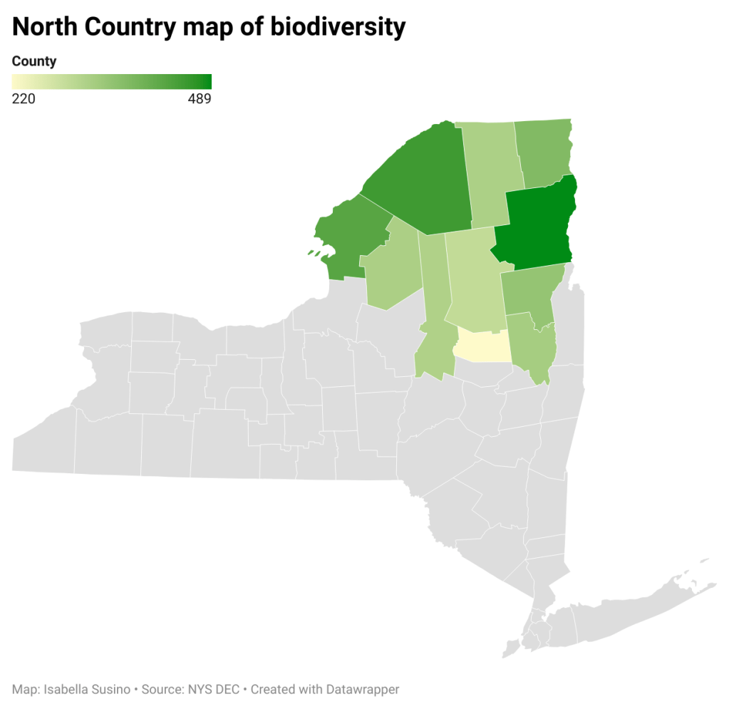
That said, when used well, maps can elevate insight. Datawrapper us a widely used data visualization tool, and offers three map types that are designed to serve a distinct purpose. First among them is the choropleth map, which shades geographic areas according to a single variable (such as population density, income, or voter turnout). It’s useful when showing rates or ratios that vary from region to region.
But as Datawrapper emphasizes in their article What to Consider When Creating Choropleth Maps, these maps require thoughtful execution. Values should be normalized (percentages, not raw counts), and colors chosen with perception in mind. Dark shades should not exaggerate small differences, nor should they flatten meaningful distinctions. Granularity matters: state-level choropleths can conceal trends that county or block-level maps reveal. When used with precision, choropleth maps invite exploration of regional patterns that matter.
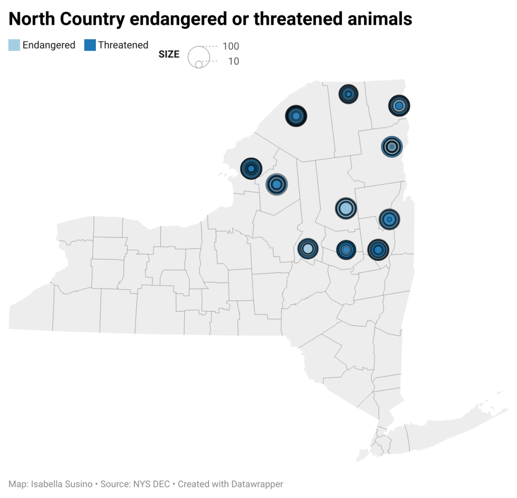
Symbol Maps: Pointing to the Source
Symbol maps use circles or other shapes to represent data at specific points on a map. These are ideal when you want to compare quantities across locations, like store openings, fire occurrences, or hospital bed availability. Unlike choropleth maps, symbol maps don’t depend on regional boundaries. They let you place data exactly where it happened, offering spatial precision and layered meaning. However, they can become cluttered, especially when there are higher density in data for a location, and require careful scaling and labeling to remain readable.
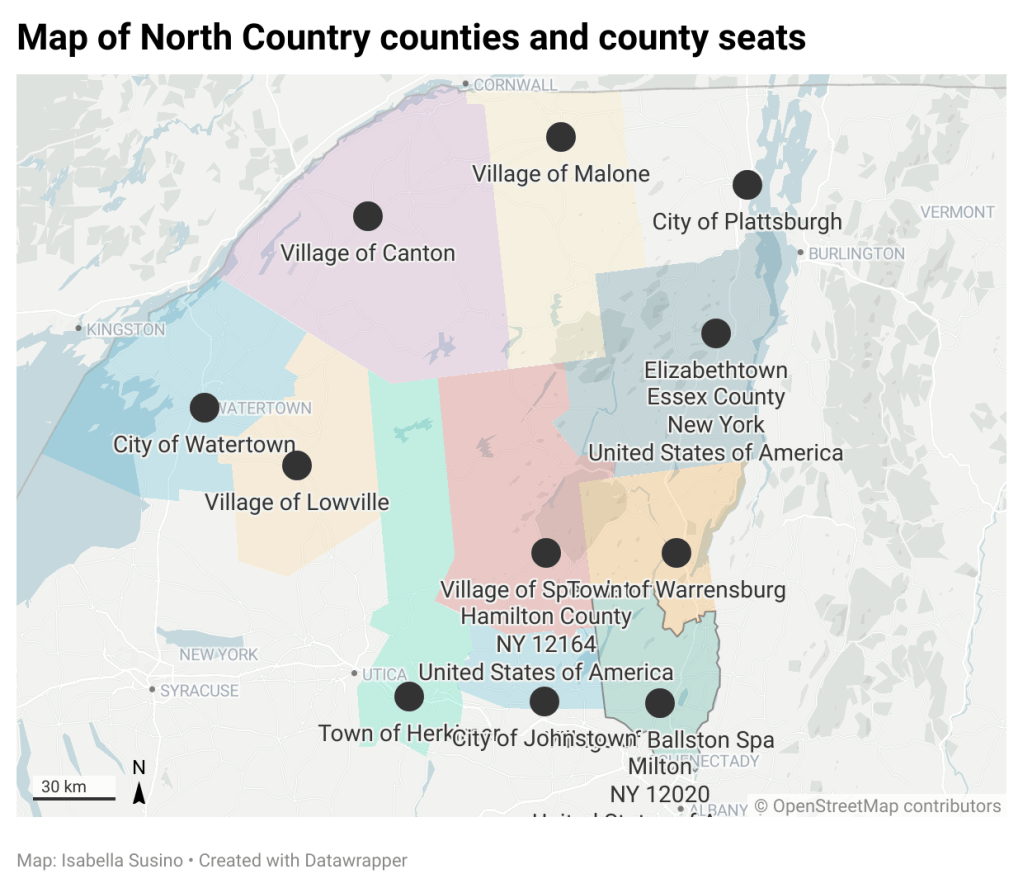
Locator Maps: Setting the Scene
These are the least data-heavy but often the most helpful. These maps serve as geographic context, answering where exactly something is happening. Whether marking a wildfire’s proximity to a town or the location of a remote research site, locator maps orient the reader. They are often minimalist, and designed to show a specific location rather than present statistical data.
Design as Interpretation
Each of these maps has its place—but none of them are neutral. As Ken Field’s gallery of 2016 election map variants shows, even a single dataset can produce dozens of different representations. But some are more illuminating than others. Maps that exaggerate partisan spread, or hide densely populated zones, risk perpetuating false narratives.
The map you choose, the aesthetics you choose, and the variables all tell your audience something. The task, then, is not to avoid maps altogether, but to utilize them with intent.

Leave a comment