I’ve been sitting with the question of what technological advances in data visualization have actually done for society, and it’s not a simple answer. On one hand, the tools we have now are powerful, and on the other there’s the overconsumption of media that causes us to be overstimulated.
Platforms like Tableau, Flourish, or even Excel’s newest features can take raw data and turn it into something meaningful within minutes. That’s huge! It means more people can tell the data’s story without having a full-blown presentation of it.
But then there’s the over-cooked data presentation – to prioritize the artwork over what the data actually means with graphics that seemingly make no sense. Technology can make things too pretty, to the point where the relevancy in the data gets lost in the whole thing. It becomes performative instead of informative.
So what makes a good chart?
For me, it’s simple: clarity with just enough of my soul in it. I want to be able to look at it, understand it, and maybe even enjoy looking at it. It doesn’t have to be the next Picasso. It doesn’t need three drop shadows and a scrolling effect. It needs to communicate what the data is saying, and ideally, make me care, while being nice to look at.
I tend to respond most strongly to visualizations that include a human element. For example, there was a piece by The Pudding that visualized women’s pockets compared to men’s using real jeans measurements. Check out their drawings and pocket size comparisons below.


Obviously this stuck with me. Not just because it was well-designed graphics and interactive data, but because I related to it in my everyday life. It was something I felt before I even saw the data. The chart didn’t need to be fancy; it just needed to show me the disproportion in a way that made it visible and undeniable.
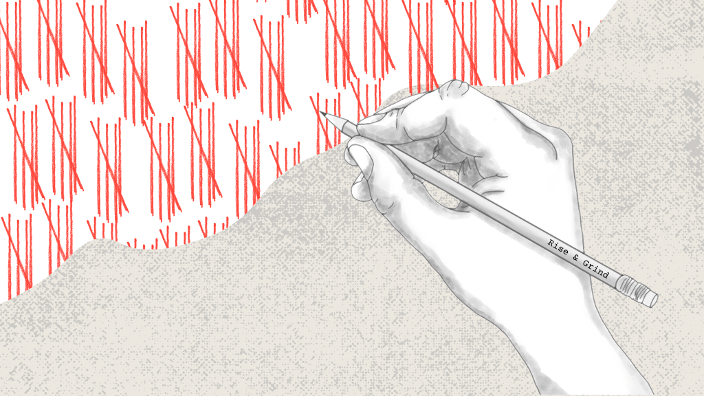
I’m also drawn to charts that live in physical space—like hand-drawn maps, chalkboard tallies in community centers, or even public art installations that track something with colored yarn or dots. That kind of data visualization feels embodied and intimate, which is something I’ve been thinking about a lot my own data tracking project.
So yes, technology has opened doors for data visualization. But sometimes, the best chart is the one that meets people where they are—on paper, in their pocket, or passed across a table in a little notebook filled with handwritten tallies and timestamps. Sometimes, the most honest stories are still the ones we make by hand.

Leave a comment