Prototyping as a whole sounds like a complicated process. Actually, it can be made very simple using broken down steps.
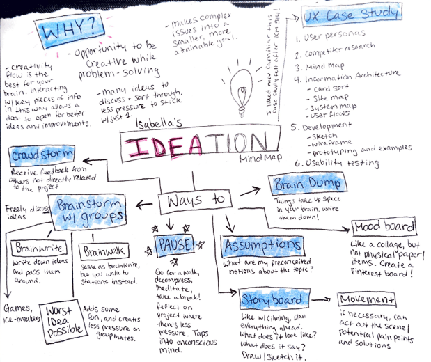
Ideation
If you want to create something using a brand new idea, it’s best to start off with ideation. That can look like several different ways, depending on what works best for you. See this mind map, another form of ideation.
After deciding on an idea and using ideation techniques to solidify the ideas, the next step is research. For example, the non-profit that I studied, Walking For Rochester, has a website and mobile app. Since I volunteer my time to them based on their marketing needs, I am aware of the changes that need to be made to their website. Taking a closer look at their mobile app, I realized that I can make some changes there too.
Site mapping
First, I needed to map out the website and see how the app compared to it. What should the app have that the website doesn’t and vice versa. This is called information architecture (IA).
Informtion Architecture focuses on the organization of information within the design of a website. There is a balance between organization, flow, and function, and IA assists in finding that balance.
Think of IA as the backstage, a show cannot function without those critical pieces. The lights don’t turn on, the curtain doesn’t rise or fall, backgrounds don’t change. But, it’s not something that the audience sees from their seats.
Another example of IA is the blueprint of a building. The architect needs to put specific details about rooms, walkways, windows, etc. Now think of the blueprint as the website as a whole, the rooms are different landing pages, walkways are the navigation menus, and windows are previews you see of content.
Right now, the app is aimed at the Volunteer Program users, but to make it universal for all of our volunteers there is more information needed.
So, how is site mapping applicable to an app? (If you missed my previous blog about site mapping, check it out here). It still defines the general structure/architecture of the app. It helps developers plan where content will go, and it will also help them to develop the most streamlined user experience.
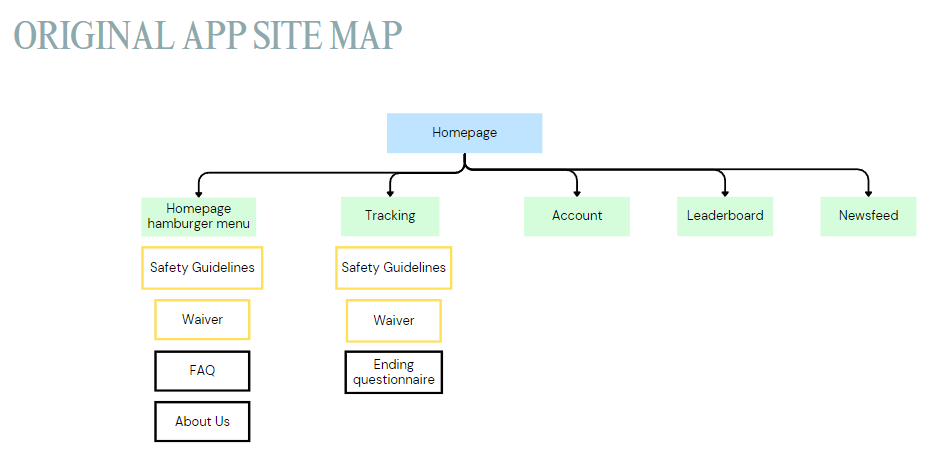
Now that the app is mapped out, I can see where the content needs to be streamlined and where potential mishaps can happen. I can now fix this by creating a new site map, designing said pages, and later – prototyping the new pages.
Low-Fidelity Sketches
Low-fidelity means that there wasn’t a lot of detail put into the sketches, other than the general idea of the flow and design. Nitty-gritty details are left out until later on.
Here you can see some pages on the app that already exist, but I mapped out anyways to get the full experience.
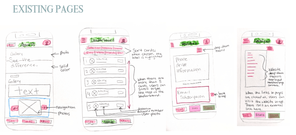
And below are some pages that I thought we should add to the app to make it more uniform and easy to use.
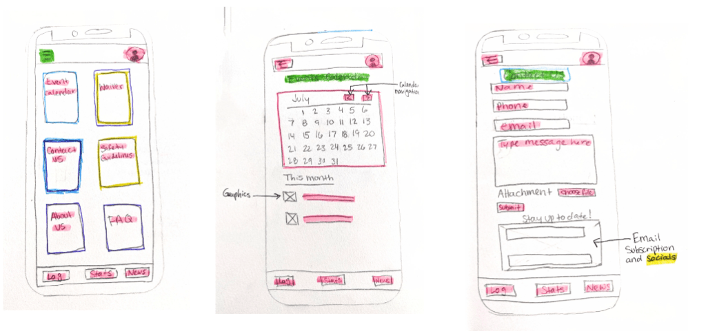
It took a couple of tried to get the hamburger menu options right, but once I landed on using the cards it felt right. I like apps that use the card buttons, it makes it so much nicer to use. Since these are not currently on the app, this was my main focus for my user testing.
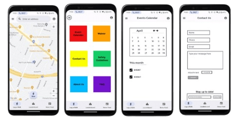
High-fidelity renditions
Now that the low-fidelity sketches are done, I can go onto creating high fidelity renditions. The hamburger menu, events calendar and contact form are all new, and because I don’t have access to the media used on the actual app, they are lower quality than the screenshots of the app.
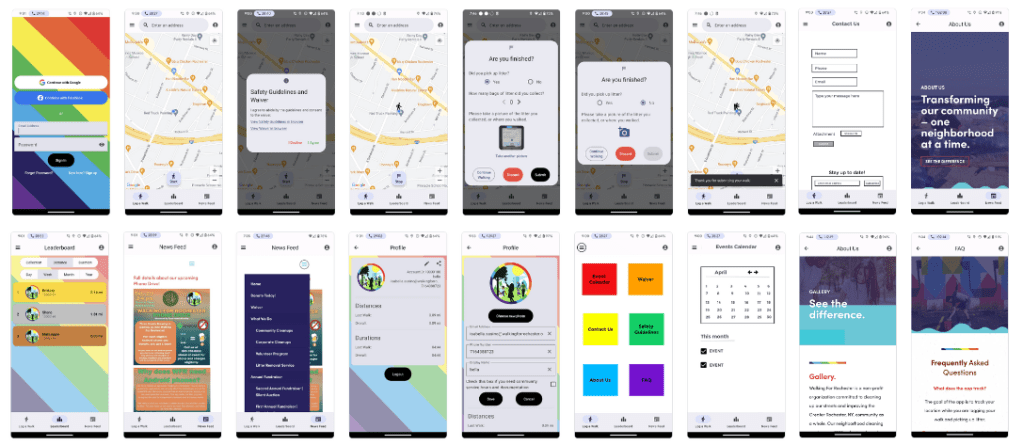
These are also already input into the prototyping platform called the Marvel App. Check out the prototype yourself here.
The next step was user testing. Check it out here:
Please click here if the video isn’t populating.
Analysis of user testing
My first test subject, Jacob (23), was a little nervous to be recorded. We did a practice round, and he clicked the newsfeed button for Task #2 instead of going to the hamburger icon and stated “I don’t know why I did that.” During the recorded session, he did press the hamburger menu and was able to navigate to the events calendar successfully.
Overall. both test subjects were able to complete all of the tasks without any hesitations or mistakes. The app content seems to be in logical places, meaning that the content is where users predict it would be. With the proposed changes, the app would be increasingly more attractive and uniform.
The use of the Marvel App for creating a prototype was an adjustment at first, but I quickly learned how to complete the designs. Using the prototyping function of the Marvel App was a really cool process, as this kind of platform I haven’t used before.
The walk-through of the prototype
Please click here if the video isn’t populating.

Leave a comment